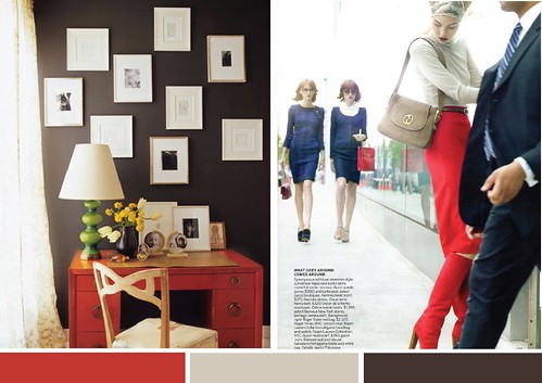
Rich chocolate calms the intensity of ruby red and the cool taupe adds a cozy but light feel. Perfect for classically tailored rooms and ensembles!
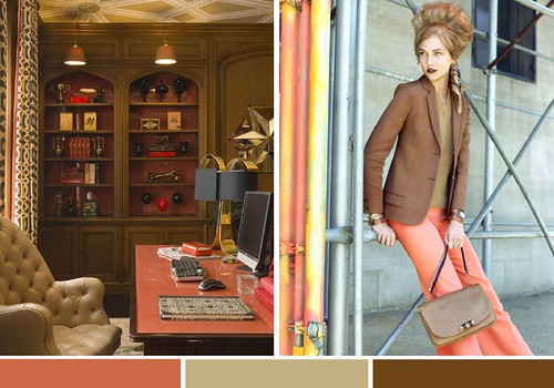
I'm adoring the richness of bronze for fall - paired with an unexpected coral is stays current and fresh!
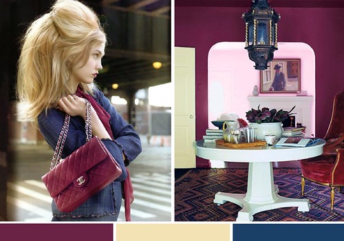
Mmmm, very berry, don't you think? The saturated plum and teal gets a little lift with a rich cream! Especially loving this combo for inspired tabletops right now too!
*editorial images by raymond meier, interiors via unknown, jay jeffers and domino