Showing posts with label color. Show all posts

PERFECT PALETTES:

Some palettes never die for me and this is one of them. I adore the combination of this rich green (with a hint of teal) and bronze together...
105982781_1tFX9o6q_c
palette green gold black
105784178_ddXRzYLz_c
A kick of golden mustard or peach gives it a nice punch, and black adds a bit of drama. It's similar to this palette I put together last January - just a new evolution! Whenever I see color combinations reemerge in my life, I take note. I'm pretty sure it means they're ones I can live with for quite some time. What color combos are a constant in your life?


*images on pinterest via wearing the pants and flickr

A BOLD (NEW) BOURDEAUX

Tonight at Neiman Marcus I'll be helping to present some of the fall's biggest trends with a mini fashion show featuring some of my favorite picks from the store. I'm so excited to be doing some fun things in the fashion arena, as you all know my work usually leans towards interiors. But I'm even more excited that one of their top trend picks also happens to be one of my current favorites: bordeaux!
burgundy
burgundy+orange jakjilljpg
burgundy2
Paired with a refreshing mint, tangerine or bold blue, this rich wine hue is taking on a whole new life far from the heavy, formal style it used to live in. I can't wait to share some of the bordeaux looks we came up with for the show!

*images via j.crew fall collection, interiors via mixr, clutch detail via jak&jil, tumblr

LA DOLCE VITA: MORE RED + GREEN

Yes, I'm still obsessing over the color combo of red + green as we head in August and the sweetest part of summer...
la dolce vita red+green colorboard coco+kelley
Evoking some vintage nostalgia and a nod to Italian culture (I mean, could that Dolce & Gabbana dress say it any more perfectly?) this mod mix is the perfect style inspiration for the rest of summer... and right on into fall too!

*resources: red pendant light, coco cozy pillows, anthropologie leather bag, dolce & gabanna shift dress, vespa, louboutin gingham pumps, retro outdoor chair at crate & barrel

PASTELS + BLACK

When decorating (or dressing) with certain colors I think there are little rules that we somehow place on ourselves - one of them being the use of black with softer palettes. Most people tend to shy away from the dramatic neutral when using such quiet hues of lilac, pistachio, blushing pinks or buttery yellow. When, in fact, it's exactly what they need...
balenciagashades.jakandjill
Set of six place settings in Slightly Bright
via house&home.lilac
Wouldn't you agree? To me having a little black accent in a room is just as necessary as having that little black dress hanging in your closet.

*top photo, balenciaga via jak&jil, dishware available at gretel home, room via house & home

RED, WHITE + GREEN?

While I work on putting together a few more posts from my travels in Italy, this color combination seems quite appropriate to share with you this morning...
red green white
A preppy twist to red, white and blue, the switch to green is unexpected for summer, don't you think? I love the little addition of pale blue or aqua to keep it feeling fresh, too.

As a side note, Nick Olsen really hit this little studio apartment out of the park with his fun design - I immediately tore out the white sofa with green piping for my inspiration board. If you haven't seen it (all over blogland), check out the whole thing on House Beautiful's site.

*pillow by unison, beach umbrella bag by roberta freymann

A SOFTER SIDE OF SPRING

This year, we've seen brights everywhere for spring. They're fun and cheerful, and I adore them, but there's still something to be said for soft neutrals...
spring palette pink+grey+black+peach
Especially with the way they look against tanned skin! I especially love the touch of dramatic black (or deep charcoal grey) against this soft feminine palette that has always been a favorite of mine. So, so gorgeous. Funnily enough, I've always loved this combination of colors for a wedding palette, but i'm loving it for fashion, interiors and an everyday tabletop setting too. Stunning and romantic.

*images: interior via simply grove, street style via unknown and tabletop by jane packer

THE APRIL PALETTE

In case you're wondering..
anthropologie color inspiration
I'm basing my next inspiration board in the office entirely around this palette from the latest Anthropologie catalog. Seriously - this one was so good. The colors were insane! Kinda reminds me of this palette - but  bolder and better!

A RECURRING THEME...

Not that I usually recommend one color palette for an entire home (unless you have a very small space to work with) but....
traditional home.charlotte slate benmoore
domino.changmai
lonny mag.living room
The mix of rich teal with pops of red has been one that just seems to stick with me! Yesterday I reported from my twitter that there is still a big surge of teal in the marketplace - we saw it in lots of leather goods in High Point - but my favorite way to use it is definitely as a base for the room - whether on the walls, cabinets or floors - with that pop of red and plenty of natural light so it doesn't feel too heavy. Do you think this a color scheme that's doable for your home?

*images via traditional home, domino and lonny

BEHIND THE SCENES: RUE COLOR TREND PAGES

Ever wonder how those many market pages in the front of magazines get put together? Well, I don't know how the other mags do it, but here's a peek behind my process as the Market Editor at Rue!

When I begin putting together the color trend pages, I usually start with pulling runway shots and interiors that appeal to me in the moment, coming up with a few different options to select from. For Issue #4 I wanted to find a combination of color that included some of the bold colors that we're seeing in the marketplace, while still remaining sophisticated and realistic as palette that others would want to imitate in their home or wardrobe...
tumblr_lao7twzslt1qc7jkjo1_1280
There were many options (a few of which you may see in future issues!) but I kept returning to two images - the room above and the Tracy Reese runway look below. The palette conjured up images of vacationing in the Caribbean while being soft enough for spring - a perfect mix! Then comes the fun (and challenging!) part... shopping!
marine+layer coco+kelley
Once the palette is chosen, I spend hours and hours combing through my favorite sites to find pieces that might make the page. Then, I send all my options on to our Art Director, Bri, and we pick the best of the best to make the page. And the leftovers? Well, usually they get ditched, but today they get their day in the sun right here. I especially love the striped options because they mimic the original room... what are your favorites?

*resources: 1. tomas maier dress 2. grecian pillow at wisteria 3. matiko sandal at urban outfitters 4. tabac chair at jayson h&g 5. a.l.c. tank top 6. stella mccartney skirt 7. vases at lamps plus 8. undersea lamp at anthropologie 9. mali sabatasso necklace 10. jonathan adler bolster pillow 11. j.crew sawyer hobo

PS - to get your sneak peek behind the 'looming large' trends page, head on over to the Rue blog today where I share more wonderful wovens!

FROM FANTASY TO FÊTE: ARTY PARTY

Happy spring, all you gorgeous c+k readers! Camille Styles here, with today's "fantasy" that proves I'm dreaming of a season brimming with brilliant color...
Art-Party-cocokelley-CamilleStyles
Why not throw a party that takes a cue from the vivid spectrum of a painter's palette? A canopy of hand-cut garlands, packages tied with rainbow yarn, and pantone-inspired place cards are perfect inspiration for a fête that's full of little surprises.
Food Fashion Friends-Art Party
Bold color is even more jaw-dropping when placed against a stark white background. This particular scene is set in a photography studio, although any warehouse space would do the trick just fine.
Food Fashion Friends-Art Party 3
A monochromatic background shines when bursting with pops of color, like these multi-hued glass vases that serve as a modern alternative to a floral centerpiece. Such an occasion most definitely calls for a menu with a few surprises:
meyer lemon soufflés reveal a deliciously creamy center when cut. Check out the recipe for these, and the rest of our Arty Party menu here.
Food Fashion Friends-Art Party2-500
Is this not the
most clever way to assign seating? Black painters' tape laid artfully on painted concrete provides sharp contrast in black and white, inviting guests to settle in and take their seat on the floor. (Don't forget to throw lots of pillows around for those who prefer a bit of cushioning!)
Food Fashion Friends-Art Party 4
Multi-hued glass vases are an artsy alternative to flowers on the table. I'd love to collect
one of these in every color!

*images: {row 1} french colours poster, garland, tickets, crudites {row 2} pastels, cake {row 3} rainbow dress, knitted gift, garland, colored sugar {row 4} party horn, cake, pantone seating cards, rainbow chairs. All party images scanned by me from food fashion friends.

RAINBOW ROUND THE TABLE...

In the latest decision concerning my next living space... I've decided that I absolutely must have colorful dining room chairs...
rainbow of chairs coco+kelley
For a girl who can be a little shy of commitment, I think this is just enough of a pop of color that I won't regret saying "I do." And it adds so much fun to the space! Now the question remains... what color? I did a little dream browsing at 1st dibs last night to consider my options...
red orange yellow chairs coco+kelley
green blue purple chairs coco+kelley
I'm pretty sure the yellow are my favorite... but the style of the purple are so glam... and we all know I'm a green girl... Funny how I could design so many types of rooms around these chairs, and yet I'm drawn to each of them for different reasons. What are your faves?? What color would you go with?

*rooms via (clockwise from left): william waldron, mwm, mikkel vang for aussie vogue living, jamie drake, kristin ewart for domino, and elle decor  chairs all via 1st dibs: red, orange, yellow, green, blue, purple

OLD IS NEW (AND FRESH!)

The return of retro styling is bound to have all sort of impacts on trends these days (for better or worse), but one I can I can absolutely deal with is a resurfacing of palettes like this...
retro palette1
retro palette2
From Rachel Zoe's current Missoni pillows to Gio Ponti's vintage geometric influences - old is new again.


*images: grace kelly by howell conan, rachel zoe's home photographed by richard powers, shoes via martha stewart, and gio ponti via molly loot

MY SPRING PALETTE: APRICOT + BLUE

It's official - I'm making this my spring color palette inspiration:
spring fashion color palette blue apricot coco+kelley
I've already purchased a pair of apricot shorts and a very peachy little belt from Anthropologie, and I adore the way it looks with a pop of blue (any shade will do!). Which is funny because this was what my inspiration board looked like for last spring...
2010 - 225
Basically the same line of thought, but a little richer, with indigos and clay reds. I guess I should really start following my own advice a little sooner when making wardrobe purchases! I like freshening it up with black and white accents though - much more current!


*image ali stephens for elle france (source unknown) and inspiration board by coco+kelley

COLOR REVOLUCIÓN

Big hats, bold graphic prints, layers of texture and - above all - glorious color. This is the kind of editorial that perks a girl up on a Monday morning!
nicolebentley5
nicolebentley12
nicolebentley6
nicolebentley8
Of course... it also makes me wish I were in Mexico...
nicole bentley.vogueaus
All from the latest issue of Vogue Australia, shot by Nicole Bentley... If that cover doesn't sell copies, I don't know what will.

*via fashion copious

VINTAGE VENETIAN GETS FIERCE

Soft time worn walls and shutters in Venice create an inspiring palette...
cherryblossomgirl.venicecolor combo green+peach+poprihanna by mikael jannson for Interview ma FGR
To be translated into something way more fierce! The pops of color (brought in by the flowers in the first photo and accessories and makeup in the second) are essential to keeping the combination of antique green and terra cotta peach feeling updated and fresh.

*images via cherry blossom girl, rihanna for interview mag by mikael jansson

LILAC TO LEOPARD: THE MAKING OF AN INSPIRATION

Over this past weekend I finally made myself get out to the huge Picasso exhibit going on here in Seattle, and as I wandered through rooms of sketches and paintings I started wondering about the crazy creative processes that artists go through in their head...
selby_HervePierreED27876
The way we each take things in and then put them back out into the world is so unique. For me, my eye is constantly drawn to color, texture, and patterns - drawing them out and putting them together into something that makes sense. I take pieces of inspiration and connect the dots to create a larger idea...
Seneca Rising Spring 2011 by Zoey Grossman
And what does that look like in my mind? Well, something like this actually. Jumping from the first photo to the second, it's the colors that bring them together, but in the second photo, it's the leopard print shoes that really pop out to me, which brings us to this lovely shot below...
jacklynpaige
Put them all together in little pieces of inspiration, and this is what you get!
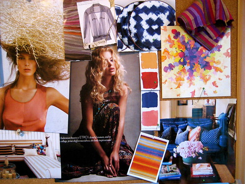
leopard+lilac inspiration clips coco+kelley
Lots of lovely lilac highlighted by shots of orange and yellow, mixed in with unexpected leopard and some ethnic stripes. Saying that out loud, it sounds a bit jumbled and crazy, but looking at it all together, you can see how it works. And, voila! Inspiration for a room, a tabletop, or even today's ensemble.

How does your eye see it?

*images via the selby, photography by zoey grossman, via jacklyn paige

WINTER BLUES

Every January I hit this post-holiday realization that winter is not even close to over...
floral-skirt.fabiobarelet
... it's around this same time that I gravitate to bold hits of blue against warm creams and fresh whites...
milesredd.nymag
Perhaps it's a craving for blue skies or tropical destinations?
2c_davidshields_364L
Maybe it's a pull towards something strong as we try and push our way into Spring...
via moth design
Or - most likely - it's the fact that this bold royal blue brings a surprising sense of calm at the end of a hectic season and a breath of fresh air with the revitalization of a new year at all once. Either way, I think I'll try adding some doses of it into my life, pronto.

*images via fabio bartelt, miles redd via nymag, david shields, and emily henderson

ALLOW ME TO DEMONSTRATE...

Yesterday I mentioned how mustard yellows and teal greens were heading to the top of the color list for 2011...
392_4_11g
Well I just so happened to stumble across this home that perfectly pairs the two together in a very cozy but modern bedroom (whose gorgeous chiffon-esque drapes have me drooling...)
nuevoestilo.greenbedroom
I love the addition of stronger neutrals to the color scheme and how the wood tones pick up that mustard yellow too. The use of white keeps the saturated jewel tones from feeling too heavy - a good way to keep the colors moving forward into spring! But for now... how fabulous are they for winter too?
nuevoestilo-greensofas
They even brought the color scheme into the living room with a pop of mustard against that dramatic rich green sofa! Love!


*images via nuevo estilo

COLOUR + A DETACHER

Beautiful color palette inspiration from A Détacher's Spring 2011 line...
a detacher1
The contrast of the nude with lilac and garnet red is so so so stunning...
a detacher3
And I'm loving the strong color blocks in what are sure to be two of next season's hottest shades - a jade green that's almost teal and a rich mustard brown. As a side note, I've suddenly been drawn to this vivid blue again lately. Hmmmm....

*images via style.com